Access your Back Office at your fingertips.
Download the app now on Google Play Store.
Scan the QR code
You can also scan QR code with your phone to download the app.
How to set up app engagement cards on the admin console
Engaging your customers goes beyond offering loans — it’s about building trust, encouraging repeat activity, and keeping them informed. With App Engagement Cards, you can now create personalized banners that show directly on your customers’ dashboard inside the app.
Think of them as digital billboards within your app: announcements, promos, reminders, or nudges that catch your customers’ attention at the right moment.
What are App Engagement Cards?
App Engagement Cards are small, customizable blocks that appear as banners on your customers’ dashboards. They can be used for:
Promotions: Highlight special loan offers or seasonal campaigns.
Education: Share quick financial literacy tips or product guides.
Reminders: Notify customers of upcoming repayments or savings goals.
Cross-selling: Encourage customers to try additional products you offer.
Step-by-step guide
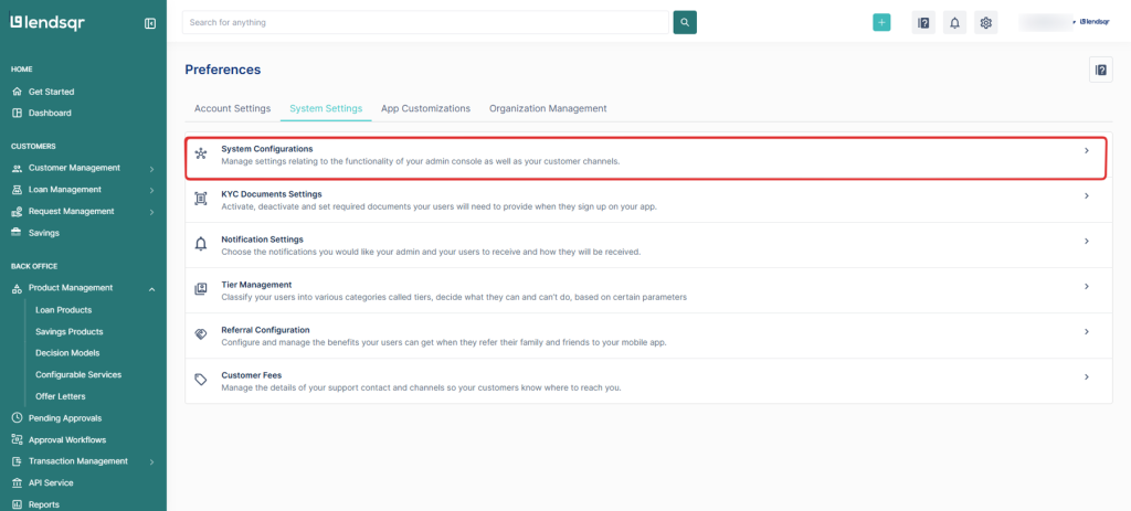
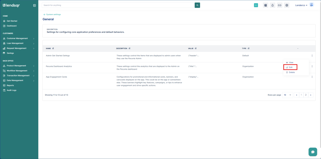
1. Click on the “Settings” icon at the top right corner of your screen.
2. Select “System Configurations” under “System Settings” in the resulting page.
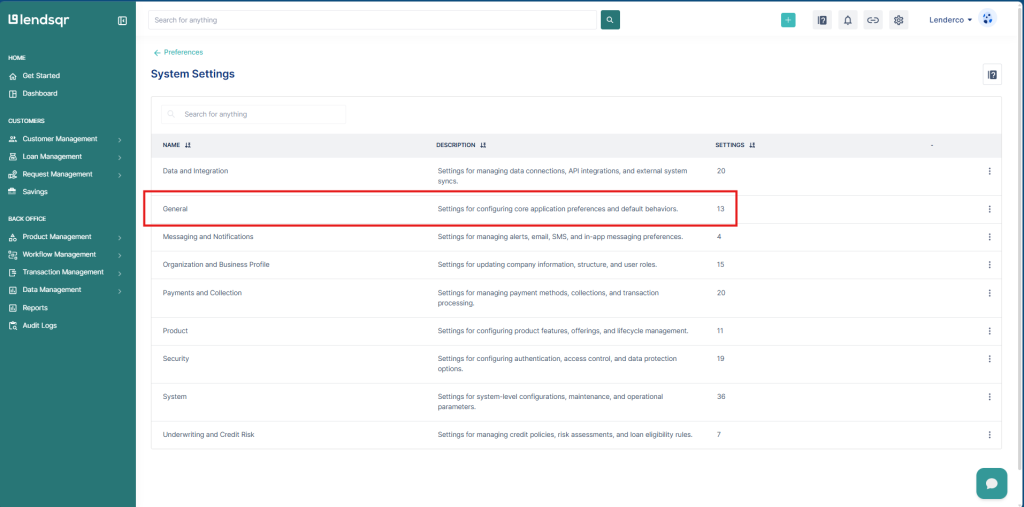
3. Click on “Organization Settings”
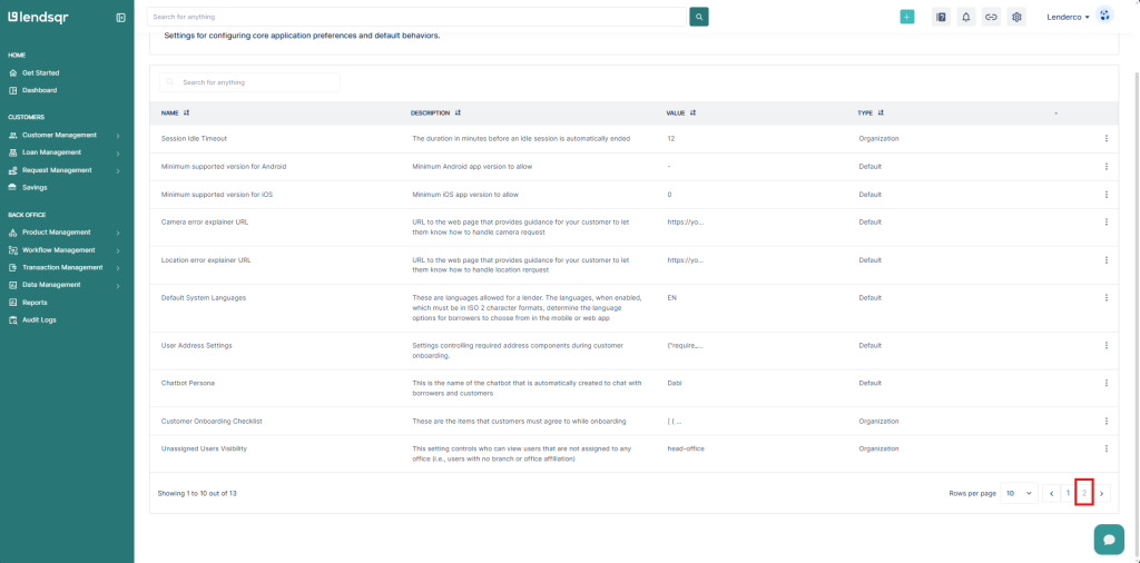
4. Scroll down until you see the pagination on your bottom right and click on “2” to open that page.
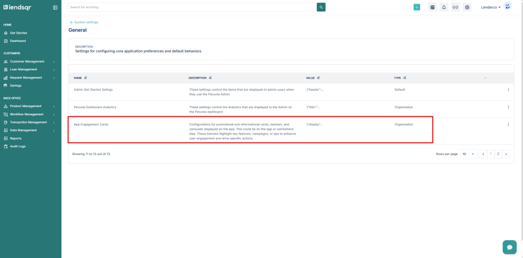
5. Click on the more options button on the “App Engagement Cards” and select “Edit“
By default, Engagement Cards are turned off:
{"display": false,"data": []}
This means even if you have test data, the cards won’t show until you explicitly turn them on.
👉 To enable cards, simply update the display flag from false to true.
{"display": true,"data": []}
Once switched on, the system will begin rendering cards defined in your data array.
The Data format explained
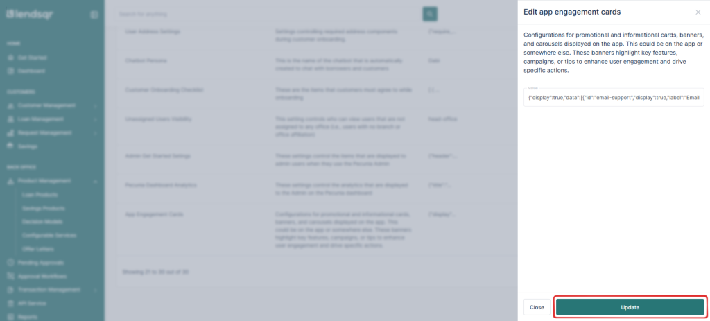
Each card you create follows a JSON structure that allows full customization. A sample test data looks like this:
{"display": true,"data": [{"id":"email-support","display":true,"label":"Email us for support","sub-label":"Get quick help from our team.","button-label":"Send email","media-url":"","url":"support@lendsqr.com","url-type":"mail","card-color":"black","text-color":"white"},{"display":true,"label":"Call our support line","sub-label":"Speak directly with a specialist.","button-label":"Call now","media-url":"","url":"+2347000000000","url-type":"phone","card-color":"","text-color":""} ]}
Here’s a breakdown of the key fields:
Key Fields
Field
Description
Example
id
Unique identifier for the card.
"email-support"
display
Toggle to show (true) or hide (false) the card.
true
label
Main title displayed on the card.
"Call our support line"
sub-label
Supporting text or description.
"Speak directly with a specialist."
button-label
Call-to-action text shown on the button.
"Call now"
media-url
URL for an optional image/logo on the card.
"https://cdn.lendsqr.com/logo.png"
url
The action link (email, phone number, webpage, in-app route, etc.).
"support@lendsqr.com"
url-type
Specifies type of action (mail, phone, web, location, settings, route).
"mail"
card-color
Background color of the card (optional).
"black"
text-color
Text color on the card (optional).
"white"
6. Set up your cards data in JSON format. Copy and Paste into the value field in the resulting modal.
7. Click on “Update” to save the changes you just made to the setting.


 feature")